The purpose for designing the LOGO
The Second IHQF General Assembly decided to designate the second Sunday of August each year as "World Health Qigong Day". The first World Health Qigong Day will be held globally on August 13th, 2017. The aim of World Health Qigong Day is to let people from around the world better understand Health Qigong, and to create a more positive atmosphere for the long-term development of it.
The organizer of World Health Qigong Day is the IHQF, with the co-organizers being the member organizations and relevant partners. The IHQF entrusted the design of the LOGO to a high-level design studio. Recently, the IHQF Executive Board selected the formal LOGO of World Health Qigong Day through voting.
The LOGO of World Health Qigong Day can make this event more popular with the general public, and draw the member organizations and those Health Qigong enthusiasts even closer to the IHQF. The LOGO will also make it easier for the member organizations to carry out promotions for Health Qigong.
The connotations of the LOGO
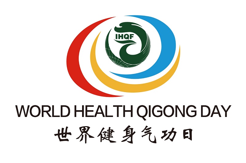
The logo of the World Health Qigong Day keeps the original image and flavor of the IHQF logo. The dragon and the phoenix symbolize Yang and Yin respectively, therefore the combination of dragon and phoenix connotes the balance between Yin and Yang in Health Qigong, as well as the refinement for both body and mind in traditional Chinese culture. On the other hand, the dragon and the phoenix symbolize strength and tenderness respectively, therefore the combination of dragon and phoenix connotes the balance between hardness and softness, as well as the unique concept of combining motion with station in healthcare.
Based on the logo of the IHQF and coupled with the abstract depiction of wind, the logo of the World Health Qigong Day highlights the Chinese concept of Qi. The simple but modern curves, painted with the three primary colors of red, yellow and blue, surround the logo of the IHQF. The whole image is meant to symbolize the concept of harmonization as well as the harmony among haven, earth and human beings. Meanwhile, the three colors also represent an ancient concept in Taoism, that is The Three begets all things of the world, thus covering all the member organizations of the IHQF.
The logo of the World Health Qigong Day applies five colors which correspond with the five elements in traditional Chinese culture. White represents gold, blue represents water, green represents wood, red represents fire, and yellow represents soil. Altogether, they constitute a perfect eco-cycle in which gold begets water, water begets wood, wood begets fire, fire begets soil and soil begets gold.

